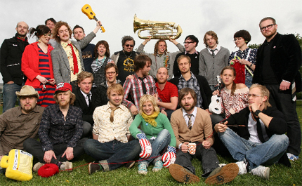
The more introductory song We're From Barcelona does more to emphasise their sheer number though - how're they gonna divvy up royalties amongst all that lot?
I've long been interested in how cropping into an image or design can totally change its message or simply its style. And the false sense of simplicity of this video is fairly perfect for this song, too. I especially like the 'pen goes faster in the fast bits' idea - so simple but could have been so easy to mess up.
As this spiked my interest I had a look at some of their artwork which is rather nice too - reminiscent of the old blue-note jazz covers. I love the idea that the singles are striking, short sharp geometric compositions, whilst the album cover quite lierally tells the bands' story whilst keeping that colourful geometric aesthetic through typography alone (bottom right).
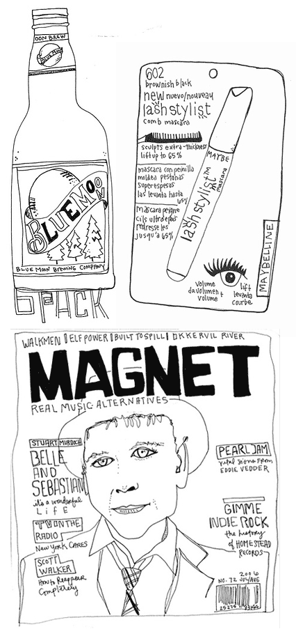
Kate Bingaman has been drawing one thing she buys every day for 190 days and counting. Character-full line drawings document the spoils of everyday life and highlight the pennies we all spend without thinking. There are no Manolos here, no splurges or treats, nothing even likely to induce the all-too well known guilt as you stride out of the shop thinking - actually, when will I wear this? Should I perhaps have paid the credit card bill first?
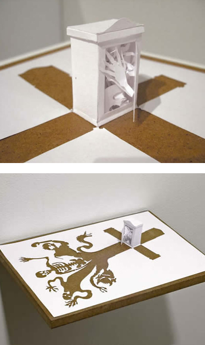
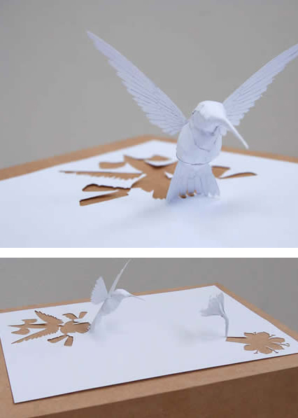
Most people wouldn't use words like spectacular, breathtaking or awe-inspiring in relation to paper-cuts (especially since the phrase paper-cuts generally brings to mind a minor office injury) but I think it's justified in this case. Peter Callesen
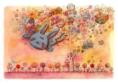
Crazy, surreal and very pretty illustrations. Alex has the sort of consistency and style that make me very jealous! In a good way, obviously... Alex Noriega's sketch-blog
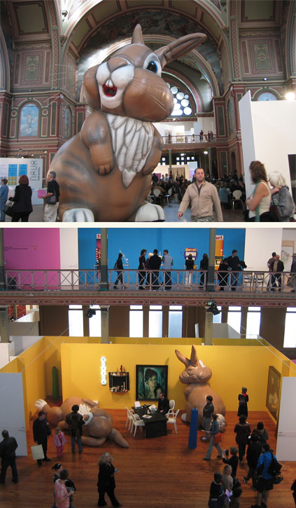
How can anyone not smile at these?! By artist Michael Parekowhai at the Melbourne Art Fair. They're called Cosmo. Not sure how they'd fit in in your average semi though. Perhaps a garden ornament?!
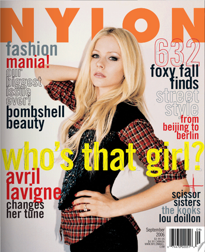
No longer do we have to wait for that lovely US magazine NYLON to be shipped over by carrier pigeon! hurrah! And it still looks great online! yay! I am rather excited - I worry about myself sometimes...
Karl Lagerfeld isn't usually a one to design something I'd sell my Grandmother for, but he's getting closer. This trinket-ey belt seen as part of Chanel's Autumn/Winter 2006-2007 Couture Show is part of a trend that (I think) is going to grow and grow. A bit of nostalgia made glam is hard not to like.
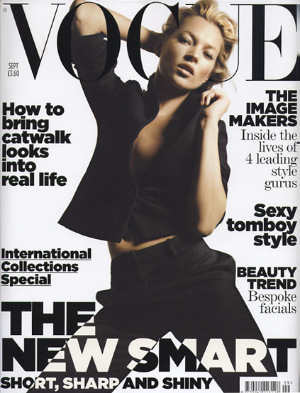
This month's (UK) Vogue cover is one of the most striking I've seen in a long time. The combination of Nick Knight and Kate Moss will never dissapoint, the the satin print finish combined with the spot-varnished typography is the icing on a very stylish cake!