Saturday, September 29, 2007

Feist

Feist
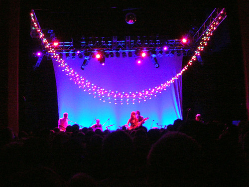
Feist's gig at the Shepherds Bush Empire the other night was really fantastic. Not the best venue for a 'standing still' kind of gig (if you're in the stalls, anyway) as it means you only really get a view of the ceiling unless you're 7ft tall. Which I am not. But the sound is great in there.

She played a little bit of Broken Social Scene but pretty much stuck to her solo work. 1234 predictably brought down the house - and I suspect that quite a number of the audience were only there to hear that one song - and at times you could have heard a pin drop between lyrics. The balance was much the same as on the album - mostly fairly simple, honest, somewhat downbeat songs punctuated with a few more upbeat songs, so it didn't get monotonous at all. My Moon My Man is still definately my favourite song though, it has a great video too (albeit owing a little in inspiration to OK GO);


The point where she invited a random audience member on stage to play the piano did seem a little odd, although it all became clear when he went on to read out a really sweet poem ending in the line, "Lauren, will you marry me?" at which point I think the audince made the most noise it did all night. She said yes... a suitably romantic highlight to a captivating gig.

website
myspace

Tuesday, September 25, 2007

The History Boys

historyboys
The first quiet weekend for months, time to buy a winter coat - it must also be time to start DVD-ing again. The first of this year's Autumn/Winter film fest was The History Boys, adapted directly from the play by Alan Bennet. So needless to say it was great. And isn't the poster lovely? Obviously it's for the play rather than the film (which had a garish lime green, fish-eye lens concoction) but as it's even the same actors I think I can get away with it...

Friday, September 21, 2007

Somewhere, on a canal in Rugby...

Priceless
I'm lucky enough to have a group of friends who all make the effort to go away for a weekend together every year, the ceremoniously titled 'Fraggle' expidition (long story). Fraggle 7 was an exciting trip down the canal from Rugby, so of course I got to see lots of lovely handpainted typography on the passing narrow-boats. (I saw quite a lot of horrible typography too but I shan't dwell on that.) I liked this one because I think it's possibly the geekiest name for a boat ever;
Electron

Wednesday, September 12, 2007

Small But Perfectly Formed

Yesterday I went to see Crafting Beauty in Modern Japan at the British Museum. It was a small exibition but fantastically beautiful. It was a really nice group of pieces actually, enough for a 'wow' factor but restrained enough not to be over-doing it, as if saying "we're really proud of these pieces, but of course there's a lot more where that came from". Which I've no doubt there is. A place where creative and craft skills and pure hard work are rewarded as much as concept and delivery, Japan seems to be really good at nurturing its artist community, designating the most accomplished Living National Treasures.

I found the Kimono/textile artists particularly inspiring. In a short interview one of them explained that he had considered what he could do with a kimono to make it different, more special. He realised that he shouldn't change the simple shape because that is part of why it's special - if you change the shape once then you will change it again and again striving to make it better, and it becomes like any other clothing. The simple shape of the kimono lets the textile speak for itself. Texile designs are produced by various laborious methods, including woodblock printing with a 2" square block, dyeing individual strands of hand-spun silk and then weaving together to create complicated (and perfect) geometrical patterns, and stencil dyeing, all done completely by hand.

Tokuda Yasokichi III
Tokuda Yasokichi III - Bowl, 'Genesis' (Sosei), porcelain with vivid coloured glazes (yƓsai), 1991. On loan from the National Museum of Modern Art, Tokyo.
This was beautiful - a coloured glaze bowl that apparently went wrong, so the artist then re-fired it at higher temperature and the stripey effect appeared - "a gift from the gods. Or an accident." Luminescent, and perfect. Perfection seemed to be a theme that runs through each and every piece actually. It's the only word for it.

Monday, September 03, 2007

Absolutely Hideous

SurfaceViewLarge
I don't normally like to post about negative things, but this idea was so horribly awful I felt the need to vent. Recommended in Living Etc this month, Surface View are heralded as a new original alternative to wallpaper. Er, what? Who the hell is going to want that giant scary child looking down on them as they sleep? Or an office plastered in a floor-to-ceiling reproduction of a postcard of the World Trade Centre? Designs aside, the website is truly horrible and actually made me feel quite sick while I was using it, along with being, shall we say, 'challenging' to navigate. Yuk yuk yuk. And the "Like it?" caption that pops up on each just rubs salt in the wounds.
I haven't included a link to them as I wouldn't want to put you through it. If you want a look Google them, I'm having no part in it.
SurfaceViewSmall

How We Are

Finally got around to seeing Tate Britain's fantastic How We Are exhibition of photography at the weekend, just before it closed for good. It was really fantastic, thought provoking and beautiful. Of course I managed to home in straight away on one of the few prints in the whole exhibition that included some interesting typography, Anna Atkins' Cyanotype title page from 'British and Foreign Flowering Plants and Ferns', c. 1852.
Anna Atkins, c. 1852
You can see lots more of them here.

Another that caught my eye was by Alfred George Buckham (1880-1986) who used his job as a pilot to take aerial photographs. The only example I can find at the moment is this quite fuzzy black and white image;
Picture 4
whereas in the exhibition the prints of views over London and Edinburgh were fantastically clear and more of a brownish, sepia colour. The London one was really detailed, with a crowd of boats all along the River.

As well as being great early aerial photos (albeit with super-imposed aeroplanes, which made them feel a little bit silly), the caption really amused me (copied from a scribbled version in my sketchbook, but I think that major points are right);
'Alfred George Buckham, 1880-1986, was the 1st head of aerial reconnaissance for the RAF in WW1, and later a captain. After crashing 9 times, he was discharged.'
9 times! Count 'em, 9. Would that by any chance be connected to the remainder of the caption;
'He took aerial photos with a heavy plate camera, and said, "If one's right leg is tied to the seat with a scarf or a piece of rope it is possible to work in perfect security".' Hmm.

Also in attendance were fantasic pieces by
Dorothy Wilding,
Percy Hennell,
Tony Ray Jones,
Norman Parkinson,
Grace Robertson (one of the very few women to work for Picture Post),
Charlie Phillips ("what makes a good photograph is to be honest.",
Nigel Henderson,
John Hinde,
the archive of The Daily Herald (now The Sun) including what I would describe as early pap shots of Diana Dors,
Tom Wood,
Keith Arnatt,
Stephen Dalton,
the inimitable Martin Parr,
Paul Seawright,
Anna Fox,
Susan Lipper and
Penny Klepuszewska.
All of whom I'd recommend looking up. Phew, that's a big list, sorry!

If you missed the exhibition I'd recommend the catalogue, although some of the photos really aren't done justice by a small print on a page, and neither are many of the photographers' projects done justice by a single photograph. I would have liked to have seen more of the published collections for sale in the Tate's shop.