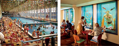
Wednesday, November 28, 2007

Thursday, November 22, 2007

Inspiration

Jennie Maneri sculpture
Every so often I'll be feeling a bit low on the inspiration front and I'll come across something that will hit me like a giraffe in the face and remind me, actually, I have plenty of inspiration. I'm surrounded by it. Actually it's prioritising it that's more of a problem.

This really gorgeous sculpture is by Jennie Maneri and inspired by the brilliant Katamari. And if you've never played any Katamari you really really should.

Friday, November 16, 2007

The Paul Smith Screen

The Paul Smith Screen
I went to a 'thing' at Nottingham Broadway Cinema this week and it happened to be in the Paul Smith screen. It's so lovely! I'm not normally the soft-furnishings type but these seats make you feel happy as soon as you walk in. I want a stripey sofa now.

Thursday, November 08, 2007

If Julia Roberts was a South Park Character...

jroberts.png
...she would look pretty much exactly like this. WHAT is going ON here? Weird floating head? Check. (I count) at least 10 different type styles/sizes on the cover? Check. Centred type for NO good reason?* Check. (Richard will love that.) Annoying and distracting type along a rose stem (ugh it made me gag just typing that)? Check. I could go on but it's making me feel dizzy. What's going on here? Perhaps it's something against Julia Roberts. She looks pretty odd on this cover too, but then so does everybody, seeing as they're green. But they've definately done miles better covers in the past.
Vanity.jpg
This one is really pretty good, (aside from a few bits of strangely centred type getting through the taste net), it's polished and dynamic and a little bit mysterious, and I love the detail of adding the George Bernard Shaw quote, it fits perfectly;
quote.jpg
*(although I have to admit the main coverline looks alright like that).

Green Chair Press

Synesthesia
Susan Angebranndt runs Green Chair Press from a studio in California she shares with a 1968 VW crew cab and a 1975 vintage race car. Her website is full of punchy letterpress prints and beautifully bound handmade books. I think I first heard of her through Decor8's Calendar Round-up, which is a bit of a goldmine in terms of small independent letterpress printers, not to mention a great Christmas Present resource! Susan also writes a really interesting blog herself.

One print that really stood out to me was Synesthesia. I think it's a really simple and beautiful representation of this strange logic.

Synesthesia on Wikipedia.

To quote a quote; Books finely printed are small castles of man —Pablo Neruda.

A Great Picture


9 W 57, originally uploaded by litherland.

By someone who doesn't believe it's a great picture.

Tuesday, November 06, 2007

Print at The Science Museum

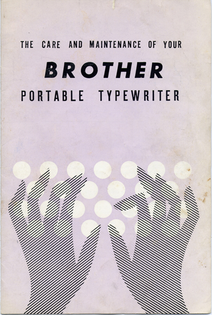
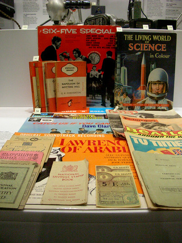
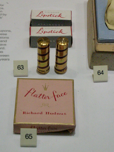
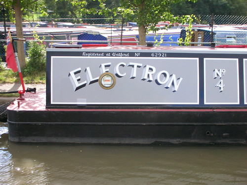
Part of my favourite section of the Science Museum - the bit with all the recent history of gadgets, tat and rubbish. The brick-like mobile phones with car-battery type attachments, the mangy looking old Barbies, the old Apple Mac, the 1960's TV Times...


Flatter Face, originally uploaded by hello.vickibrown.

Thursday, October 25, 2007

Fence of Pencils


Fence of Crayons, originally uploaded by Saima.

I tracked this back and back and back through various blogs (it's done the rounds a bit) but I still can't find out who took the original picture! It's so fantastic though it has to be worth sharing. If I ever manage to buy a house this is what I want it to look like.

Friday, October 19, 2007

Take a theme - and run with it...


Strangely fascinating

Monday, October 15, 2007

I love... lamp.

lamp1
I LOVE LAMP!
By Hiroshi Yoneya and Yumi Masuko, Producted by Cassina ixc. co. Ltd., photo by Nacasa and Partners Inc.

Saturday, October 13, 2007

Neiman Marcus

Neiman Marcus
This is a beautiful book from American brand Neiman Marcus to celebrate their centenary. If I had a spare $125 I'd be right on it. But I don't, so I'll have to look at the lovely pictures of it on NOTCOT instead.
Perhaps it's our affinity for the dramatic. Or maybe it's our penchant for the out-of-the-ordinary. Whatever the case, documenting our 100 year history in a book could never be a mundane undertaking.

See the book here.

Thursday, October 04, 2007

King Robo Dog


king robo dog
Originally uploaded by Lockwasher.

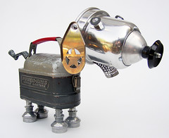
This group of sculptures by Lockwasher is crammed full of beautiful little robots and ray guns and really lovely characters.

Saturday, September 29, 2007

Feist

Feist
Feist's gig at the Shepherds Bush Empire the other night was really fantastic. Not the best venue for a 'standing still' kind of gig (if you're in the stalls, anyway) as it means you only really get a view of the ceiling unless you're 7ft tall. Which I am not. But the sound is great in there.

She played a little bit of Broken Social Scene but pretty much stuck to her solo work. 1234 predictably brought down the house - and I suspect that quite a number of the audience were only there to hear that one song - and at times you could have heard a pin drop between lyrics. The balance was much the same as on the album - mostly fairly simple, honest, somewhat downbeat songs punctuated with a few more upbeat songs, so it didn't get monotonous at all. My Moon My Man is still definately my favourite song though, it has a great video too (albeit owing a little in inspiration to OK GO);


The point where she invited a random audience member on stage to play the piano did seem a little odd, although it all became clear when he went on to read out a really sweet poem ending in the line, "Lauren, will you marry me?" at which point I think the audince made the most noise it did all night. She said yes... a suitably romantic highlight to a captivating gig.

website
myspace

Tuesday, September 25, 2007

The History Boys

historyboys
The first quiet weekend for months, time to buy a winter coat - it must also be time to start DVD-ing again. The first of this year's Autumn/Winter film fest was The History Boys, adapted directly from the play by Alan Bennet. So needless to say it was great. And isn't the poster lovely? Obviously it's for the play rather than the film (which had a garish lime green, fish-eye lens concoction) but as it's even the same actors I think I can get away with it...

Friday, September 21, 2007

Somewhere, on a canal in Rugby...

Priceless
I'm lucky enough to have a group of friends who all make the effort to go away for a weekend together every year, the ceremoniously titled 'Fraggle' expidition (long story). Fraggle 7 was an exciting trip down the canal from Rugby, so of course I got to see lots of lovely handpainted typography on the passing narrow-boats. (I saw quite a lot of horrible typography too but I shan't dwell on that.) I liked this one because I think it's possibly the geekiest name for a boat ever;
Electron

Wednesday, September 12, 2007

Small But Perfectly Formed

Yesterday I went to see Crafting Beauty in Modern Japan at the British Museum. It was a small exibition but fantastically beautiful. It was a really nice group of pieces actually, enough for a 'wow' factor but restrained enough not to be over-doing it, as if saying "we're really proud of these pieces, but of course there's a lot more where that came from". Which I've no doubt there is. A place where creative and craft skills and pure hard work are rewarded as much as concept and delivery, Japan seems to be really good at nurturing its artist community, designating the most accomplished Living National Treasures.

I found the Kimono/textile artists particularly inspiring. In a short interview one of them explained that he had considered what he could do with a kimono to make it different, more special. He realised that he shouldn't change the simple shape because that is part of why it's special - if you change the shape once then you will change it again and again striving to make it better, and it becomes like any other clothing. The simple shape of the kimono lets the textile speak for itself. Texile designs are produced by various laborious methods, including woodblock printing with a 2" square block, dyeing individual strands of hand-spun silk and then weaving together to create complicated (and perfect) geometrical patterns, and stencil dyeing, all done completely by hand.

Tokuda Yasokichi III
Tokuda Yasokichi III - Bowl, 'Genesis' (Sosei), porcelain with vivid coloured glazes (yôsai), 1991. On loan from the National Museum of Modern Art, Tokyo.
This was beautiful - a coloured glaze bowl that apparently went wrong, so the artist then re-fired it at higher temperature and the stripey effect appeared - "a gift from the gods. Or an accident." Luminescent, and perfect. Perfection seemed to be a theme that runs through each and every piece actually. It's the only word for it.

Monday, September 03, 2007

Absolutely Hideous

SurfaceViewLarge
I don't normally like to post about negative things, but this idea was so horribly awful I felt the need to vent. Recommended in Living Etc this month, Surface View are heralded as a new original alternative to wallpaper. Er, what? Who the hell is going to want that giant scary child looking down on them as they sleep? Or an office plastered in a floor-to-ceiling reproduction of a postcard of the World Trade Centre? Designs aside, the website is truly horrible and actually made me feel quite sick while I was using it, along with being, shall we say, 'challenging' to navigate. Yuk yuk yuk. And the "Like it?" caption that pops up on each just rubs salt in the wounds.
I haven't included a link to them as I wouldn't want to put you through it. If you want a look Google them, I'm having no part in it.
SurfaceViewSmall

How We Are

Finally got around to seeing Tate Britain's fantastic How We Are exhibition of photography at the weekend, just before it closed for good. It was really fantastic, thought provoking and beautiful. Of course I managed to home in straight away on one of the few prints in the whole exhibition that included some interesting typography, Anna Atkins' Cyanotype title page from 'British and Foreign Flowering Plants and Ferns', c. 1852.
Anna Atkins, c. 1852
You can see lots more of them here.

Another that caught my eye was by Alfred George Buckham (1880-1986) who used his job as a pilot to take aerial photographs. The only example I can find at the moment is this quite fuzzy black and white image;
Picture 4
whereas in the exhibition the prints of views over London and Edinburgh were fantastically clear and more of a brownish, sepia colour. The London one was really detailed, with a crowd of boats all along the River.

As well as being great early aerial photos (albeit with super-imposed aeroplanes, which made them feel a little bit silly), the caption really amused me (copied from a scribbled version in my sketchbook, but I think that major points are right);
'Alfred George Buckham, 1880-1986, was the 1st head of aerial reconnaissance for the RAF in WW1, and later a captain. After crashing 9 times, he was discharged.'
9 times! Count 'em, 9. Would that by any chance be connected to the remainder of the caption;
'He took aerial photos with a heavy plate camera, and said, "If one's right leg is tied to the seat with a scarf or a piece of rope it is possible to work in perfect security".' Hmm.

Also in attendance were fantasic pieces by
Dorothy Wilding,
Percy Hennell,
Tony Ray Jones,
Norman Parkinson,
Grace Robertson (one of the very few women to work for Picture Post),
Charlie Phillips ("what makes a good photograph is to be honest.",
Nigel Henderson,
John Hinde,
the archive of The Daily Herald (now The Sun) including what I would describe as early pap shots of Diana Dors,
Tom Wood,
Keith Arnatt,
Stephen Dalton,
the inimitable Martin Parr,
Paul Seawright,
Anna Fox,
Susan Lipper and
Penny Klepuszewska.
All of whom I'd recommend looking up. Phew, that's a big list, sorry!

If you missed the exhibition I'd recommend the catalogue, although some of the photos really aren't done justice by a small print on a page, and neither are many of the photographers' projects done justice by a single photograph. I would have liked to have seen more of the published collections for sale in the Tate's shop.

Wednesday, August 22, 2007

Si Scott

Si Scott
I can't believe I missed this exhibition - it's right up my street. Luckily Si Scott has a fantastic website with a selection of his Ink & Lyrics exhibition work and lots more besides. The full picture above really doesn't do Black Swan justice, so here's a detail too...
Si Scottl
For lots more (and much bigger) images check out his website. Lovely.

I am rubbish

Lovely Dave
I've been a little busy. I'm right back on it now. In the mean-time, here's a nice picture to enjoy.

Wednesday, August 15, 2007

Ambroise

ambroise
by Porchez Typofonderie.
I wonder how they think up those little poem-type things to show the fonts? Some of them are really quite pretty. Completely nonsensical but pretty nontheless.

Wednesday, August 08, 2007

Lego Man Update

egoleonard
Thanks to some detective work (ie. a helpful comment - thanks Anonymous, whoever you are!) it turns out he's quite a popular guy. reddit has some more in depth information but surfice it to say he has been a very popular art installation - until someone dumped him in the sea that is. He even has his own website.

Tuesday, August 07, 2007

Giant Lego Man Found in the Sea

legoman
"No real than you are". What could it mean?
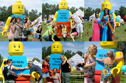
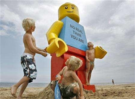
AMSTERDAM (Reuters) - A giant, smiling Lego man was fished out of the sea in the Dutch resort of Zandvoort on Tuesday.

Workers at a drinks stall rescued the 2.5-metre (8-foot) tall model with a yellow head and blue torso.

"We saw something bobbing about in the sea and we decided to take it out of the water," said a stall worker. "It was a life-sized Lego toy."

Gorgeous Letterpress Ad.

unicorns
The Selfridges website has a nice feature related to this at the moment too - a wonder search. There's a big long alphabetical list of lots of peoples 'wonders' (although unfortunately you can't read past O at the moment as the link to the next page is broken - rubbish!) that make some interesting (if slightly pointless) reading. It has a nice header too, but unfortunately it bears no relation to the ad in September's Vogue. How odd. I'd think a brand as huge as Selfridges (a guardian for a lot of other prestige brands no less) would do this a bit better really. It seems like all the thought went into the lovely ad and the rest got a bit cobbled together.

Wednesday, August 01, 2007

Marian Bantjes

Marian Bantjes
Marian Bantjes' website is full of swirling typography, gorgeous design and special bits like this, a map of influences. There are much larger details of it here. A fantastically simple idea and a lovely piece. Marian Bantjes' website is a goldmine of inspiration itself!

Wednesday, July 25, 2007

Helga Steppan

HelgaSteppan
Helga Steppan's photography is so simple but so fascinating. Groups of belongings arranged by colour into classical compositions are immediately enticing and call into question all sorts of identity, ownership and authorship issues. The Man & Eve gallery website states;
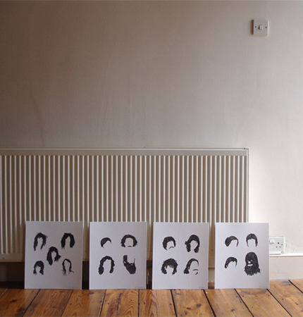
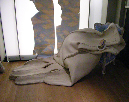
'Belongings Apart' questions the extent to which an object or possession can ever represent its owner or hold particular meaning and invites the audience to discover its own associations in the work.

I can't help wondering how this will be affected once someone owns a print of the photographs, and if/when they sell it and so on.

Surreal Things

Surreal Things
I finally got round to seeing the Surreal Things exhibition, just in the nick of time! Surrealism is quite easy to dismiss thesedays as being gimmicky and all too familiar, but seeing such a huge amount of work all in the same place was really overwhelming. It really helped give a sense of the works originality - concepts that really were dislocating and difficult and against the grain. However the use of recognisable repeated motifs fueled the transition of the style from shocking, to becoming talked about to eventually becoming appropriated into all areas visual culture. Dr MF Agha, the art director of Vogue at the time, put it really well;
"What is a snobbish art scandal today is an accepted style tomorrow and a merchandised style the next day."

Wednesday, July 18, 2007

The World is Going Simpsons Mental

Simpsons Fashion
First, a series of 7-11 stores across America magically turn into Kwik-e-Marts. Then Homer's svelte donut-wieldng figure appears alongside the Cerne Abbas giant. Now they've upstaged the world of fashion in this months' Harper's Bazaar with some help from Linda Evangelista.
I get the impression we haven't seen it all yet...
Photo BBC
Kwik-E-Mart

Tuesday, July 17, 2007

I'm back!

Lisbon
No, I haven't forgotten you, little blog. I've been in Lisbon! A bit hot, lots of touristy things, lots of tiles, lots of custard tarts, and a nice pointy sign.

Tuesday, June 26, 2007

Tom Hingston Studio

Nick Cave and the Bad Seeds
I can't quite remember how I came across the portfolio of Tom Hingston Studio but it's hugely inspirational stuff. This is the studio that art directed that Nick Cave & The Bad Seeds album with the truly beautiful cloth-bound cover. The softness of colour along with the perfectly complimenting photography and typography is so seductive and has a subtle richness about it. Other work on the studio's portfolio site is similarly gorgeous.
royksopp and diefenbach

Thursday, June 21, 2007

Tea tag

tea tag
Daily poetics has some really great little bits of ephemera on her photostream at the moment. I love this little tea tag - so much thought has been put into this tiny inconsequential thing. It didn't have to be, but it has. And it's beautiful.

Friday, June 01, 2007

Ásta Kristjánsdóttir

Ásta Kristjánsdóttir
I found Ásta Kristjánsdóttir's website via createmake. There's some really nice portraiture on there, but really I find the 'behind the scenes' ones fascinating. I love the way they expose all the falsities of a fashion shoot. Probably not what was intended but they're really great photos nontheless.

Wednesday, May 30, 2007

NAGO

NAGO
I don't speak Dutch so I'm not certain what NAGO actually is, but it seems to be a really interesting archive.

Friday, May 25, 2007

Fifi Lapin

FifiLaPin
Fifi Lapin. Rabbit. Fashion lover. Ossie Clark appreciator. Myxamatosis survivor. Haress (yes that is spelled right).

Wednesday, May 23, 2007

Hair Portraits

MrBizzleHairPortraits
Mr Bingo's famous Hair Portraits. Available from a Mr Bingo near you. Or should that be Mr Bizzle? How mysterious.

Steven Harrington

Un Royaume by Steven Harrington
Steven Harrington prints fantastic posters - get one on his website before they all sell out! Quick!

Monday, May 14, 2007

Bio Rex, Helsinki.

curtain
Bio Rex (V), by miemo.
Another gorgeous flickr find - really atmospheric, and love that mustard colour.

Thursday, May 10, 2007

a post-it a day


5.9.07
Originally uploaded by Bird in the Hand.

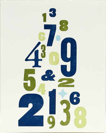
Lisa Congdon AKA Bird in the Hand's collection of daily drawings on flickr is one of my favourite regular check-ups.

Tuesday, May 08, 2007

My New Toy

Brother typewriter blog
Bargainousness at a car boot sale. And it works! See some lovely Courier here. Needs a fresh ribbon though. This original handbook was a bonus. Lovely.