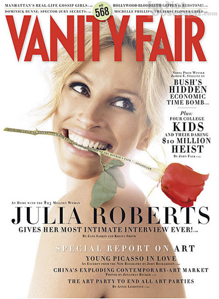
...she would look pretty much exactly like this. WHAT is going ON here? Weird floating head? Check. (I count) at least 10 different type styles/sizes on the cover? Check. Centred type for NO good reason?* Check. (Richard will love that.) Annoying and distracting type along a rose stem (ugh it made me gag just typing that)? Check. I could go on but it's making me feel dizzy. What's going on here? Perhaps it's something against Julia Roberts. She looks pretty odd on this cover too, but then so does everybody, seeing as they're green. But they've definately done miles better covers in the past.
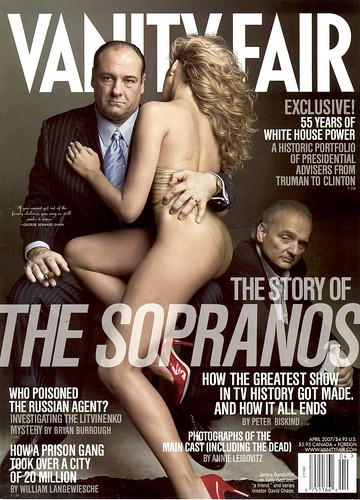
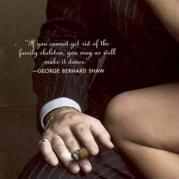
This one is really pretty good, (aside from a few bits of strangely centred type getting through the taste net), it's polished and dynamic and a little bit mysterious, and I love the detail of adding the George Bernard Shaw quote, it fits perfectly;
*(although I have to admit the main coverline looks alright like that).


No comments:
Post a Comment