Showing posts with label notgood. Show all posts

Saturday, January 24, 2009

Life in Technicolour (nightmares)


I don't get around to watching a lot of music videos, but this just appeared on my tv screen for a few minutes, and now I feel like Chris Martin is going to haunt my nightmares forever. Or a Chris Martin puppet, specifically. I have no issue with puppets, cute puppetty music videos, or puppets in rock star likenesses even. I once saw Beck play an entire set behind a small stage of Jim Henson Studio puppets, and that was bloody brilliant. The main problem I had with it was, aside from the general creepiness of the puppets (possibly a deliberate attempt to avoid being too cutesy, but really, who can tell?) is that it's SO bizarre, SO disturbing, (eerie, frightening, ghoulish, gruesome, hair-raising, horrible, menacing, nightmarish, ominous, shuddersome, sinister, terrifying, threatening, unpleasant, weird, etc...) that not only does it sit very uncomfortably with the song - Life in Technicolour, quite a classic Coldplay-being-amthemic, optimistic type of song - it actually completely distracts you from it. It insists that you don't listen to the song at all.

So, to sum up... it's rubbish.

Thank you. That is all.

Beck puppets = good. Just for your own reference.

Beck's Puppets, originally uploaded by Samuel Stroube.

Thursday, June 05, 2008

Copying is Rubbish

We live in a country where roughly 4 billion* design and creative graduates are about to spill out onto the streets from a bottomless list of educational institutions. Quite a few of them are probably quite good, too. So where's the missing link? Because there seems to be countless 'creative' departments that are being anything but at the moment. Creative Review have highlighted a few eye-watering moments on their blog recently, and I have to say BMW's latest "effort" just made me wince. Some agencies have even started recycling their own work. What's going on?

Rant over. Thank you for listening.

*ish

Thursday, November 08, 2007

If Julia Roberts was a South Park Character...

jroberts.png
...she would look pretty much exactly like this. WHAT is going ON here? Weird floating head? Check. (I count) at least 10 different type styles/sizes on the cover? Check. Centred type for NO good reason?* Check. (Richard will love that.) Annoying and distracting type along a rose stem (ugh it made me gag just typing that)? Check. I could go on but it's making me feel dizzy. What's going on here? Perhaps it's something against Julia Roberts. She looks pretty odd on this cover too, but then so does everybody, seeing as they're green. But they've definately done miles better covers in the past.
Vanity.jpg
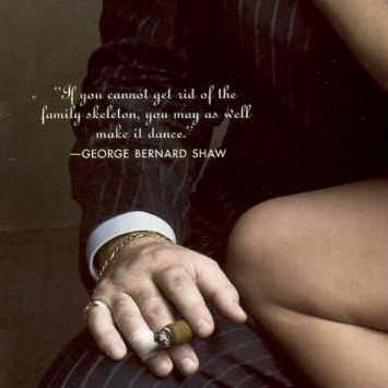
This one is really pretty good, (aside from a few bits of strangely centred type getting through the taste net), it's polished and dynamic and a little bit mysterious, and I love the detail of adding the George Bernard Shaw quote, it fits perfectly;
quote.jpg
*(although I have to admit the main coverline looks alright like that).

Monday, September 03, 2007

Absolutely Hideous

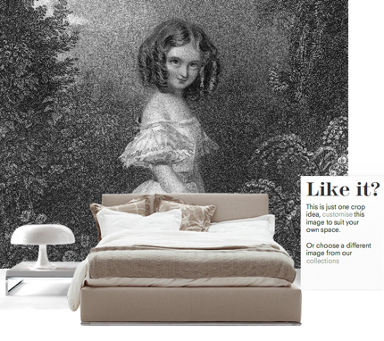
SurfaceViewLarge
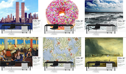
I don't normally like to post about negative things, but this idea was so horribly awful I felt the need to vent. Recommended in Living Etc this month, Surface View are heralded as a new original alternative to wallpaper. Er, what? Who the hell is going to want that giant scary child looking down on them as they sleep? Or an office plastered in a floor-to-ceiling reproduction of a postcard of the World Trade Centre? Designs aside, the website is truly horrible and actually made me feel quite sick while I was using it, along with being, shall we say, 'challenging' to navigate. Yuk yuk yuk. And the "Like it?" caption that pops up on each just rubs salt in the wounds.
I haven't included a link to them as I wouldn't want to put you through it. If you want a look Google them, I'm having no part in it.
SurfaceViewSmall