Tuesday, November 07, 2006

Battersea will never be pretty


Went for a nose around the inside of Battersea Power Station last week - the first (and possibly last) time the public have been allowed inside. It's been opened up as a venue for the Serpentine Gallery's China Power Station Part:1 exhibition which I have to say is very atmospheric - as you walk into Turbine Hall B you find yourself transplanted into what seems to be a war zone; an empty shell of a building riddled with holes - oh yes, and there's a tank in the doorway. The venue does a great job of mentally transporting you away from London and rushing and crowds and shopping, and just makes you stop. and think.

The Power Station is ugly, but that doesn't necessarily mean it doesn't have character. You can't help thinking that when this space is filled with shops, restaurants, cinemas, and whatever else the developers decide they can make money out of, it's going to stifle a large part of that soul. After seeing the Tate Galleries on the South Bank and also in Liverpool, it's clear that buildings so huge and seemingly impossibly proportioned can have a dignified second life. I doubt this one will - part of what makes it so ugly beautiful is its quiet melancholy and absorbing atmosphere, and when all of that scarred steelwork and bruised and battered interior is covered up I think it might just become ugly. But that's quite sad in itself... oh dear, going round in circles now aren't I...

Thursday, October 26, 2006

Diem Chau

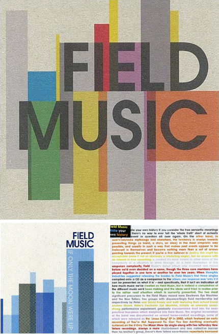
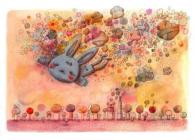
Diem Chau is an artist who likes to tell stories;

Coming from a nomadic childhood, ...the things of greatest value to us were stories contributed by friends and family. Embedded in these stories are connections to the past, our culture and an occasional escape from reality.

...small deviations are what fascinate me with oral traditions. Ordinary events injected into fantasy worlds make them more believable but, at the same time, it makes them extraordinary. Stories enable us to live a more vivid life.


I came across her Storytelling series on 
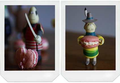
notcot.com and had to have a look for myself. I love complex, intricate work like this, as it really forces you to get involved. Here, the crayons not only represent a kind of innocence that goes hand in hand with storytelling, but being such a universal memory for everyone they really include the audience in the story. You can't help but create your own narrative for this piece.

I especially like the characters who look a little bit shy and retiring, and the way that contrasts with the bright plastic colours. The throwaway pieces of paper wrapper still left on the bottom feel really precious too.


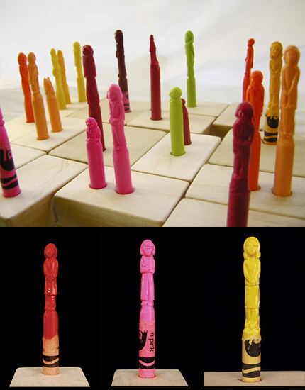
From left to right; Pigtails in Red, Bad Hair Day, Grandma in Beehive. All from Storytelling, 2005. Images copyright Diem Chau.

See more on her website, and contact her at diem@diemchau.com

Monday, October 09, 2006

I'm from Barcelona - Collection of Stamps


I'm from Barcelona's video for Collection of Stamps is just gorgeous - grey and yellow, mmmm. And as an added bonus, a ukulele! hurrah! And a rather nice song too.

The more introductory song We're From Barcelona does more to emphasise their sheer number though - how're they gonna divvy up royalties amongst all that lot?

Spotted on Superette.

Saturday, October 07, 2006

In Context


I've long been interested in how cropping into an image or design can totally change its message or simply its style. And the false sense of simplicity of this video is fairly perfect for this song, too. I especially like the 'pen goes faster in the fast bits' idea - so simple but could have been so easy to mess up.

As this spiked my interest I had a look at some of their artwork which is rather nice too - reminiscent of the old blue-note jazz covers. I love the idea that the singles are striking, short sharp geometric compositions, whilst the album cover quite lierally tells the bands' story whilst keeping that colourful geometric aesthetic through typography alone (bottom right).

FieldMusicCovers

Field Music on myspace
Field Music's page on their label's site

Monday, September 11, 2006

Obsessive Consumption


Kate Bingaman has been drawing one thing she buys every day for 190 days and counting. Character-full line drawings document the spoils of everyday life and highlight the pennies we all spend without thinking. There are no Manolos here, no splurges or treats, nothing even likely to induce the all-too well known guilt as you stride out of the shop thinking - actually, when will I wear this? Should I perhaps have paid the credit card bill first?

www.obsessiveconsumption.com
Daily purchase drawings

Friday, September 01, 2006

Peter Callesen


Most people wouldn't use words like spectacular, breathtaking or awe-inspiring in relation to paper-cuts (especially since the phrase paper-cuts generally brings to mind a minor office injury) but I think it's justified in this case.
Peter Callesen

Tuesday, August 29, 2006

Alex Noriega's sketch-blog


Crazy, surreal and very pretty illustrations. Alex has the sort of consistency and style that make me very jealous! In a good way, obviously...
Alex Noriega's sketch-blog

Thursday, August 24, 2006

Tuesday, August 22, 2006

Friday, August 18, 2006

Giant Bunnies!


How can anyone not smile at these?! By artist Michael Parekowhai at the Melbourne Art Fair. They're called Cosmo. Not sure how they'd fit in in your average semi though. Perhaps a garden ornament?!

Spotted on notcot.com

Wednesday, August 16, 2006

Finally - an online magazine that looks fantastic


No longer do we have to wait for that lovely US magazine NYLON to be shipped over by carrier pigeon! hurrah! And it still looks great online! yay! I am rather excited - I worry about myself sometimes...

Tuesday, August 08, 2006

Magpies will Love It


Karl Lagerfeld isn't usually a one to design something I'd sell my Grandmother for, but he's getting closer. This trinket-ey belt seen as part of Chanel's Autumn/Winter 2006-2007 Couture Show is part of a trend that (I think) is going to grow and grow. A bit of nostalgia made glam is hard not to like.

Saturday, August 05, 2006

Nick Knight & Vogue


This month's (UK) Vogue cover is one of the most striking I've seen in a long time. The combination of Nick Knight and Kate Moss will never dissapoint, the the satin print finish combined with the spot-varnished typography is the icing on a very stylish cake!

Saturday, July 29, 2006

Antoine+Manuel


I love these guys' work - their work is hyperactive and frenetic. A bit like a grown-up 'Where's Wally' sometimes. (slightly more sophisticated perhaps...) I'm looking forward to seeing Magazine magazine - sounds like my cup of tea!

Antoine+Manuel
Contact Antoine+Manuel

Paper Voyeur


Paper Voyeur/ r make beautiful patterned wallpapers with a twist - look a little closer...

Friday, July 21, 2006

Toy vs. Macaroon


I've never seen toys look so good. From another blog I can't read but that has some pretty pictures!
sooishi

Thursday, July 20, 2006

Eyvind Earle


Loving Eyvind Earle's art. A hefty nod to Japanese prints without the usual cheesiness, along with a pinch of Art Deco, I think they have a really quiet beauty. I could stare at them for hours depite their immediate impression of simplicity.

Monday, July 17, 2006

Camber Sands


Summer wouldn't be the same without t trip to the sea-side! Camber Sands in Sussex was the spot of choice, and a great one it was too. And I can highly recommend The Pelican chip shop. mmmmm. Really looking forward to going back later in the year, although I have the feeling the windy dunes will be less forgiving once the heat-wave is over.

Tuesday, July 11, 2006

Modernism at the V&A

ModernismVAcollage
I went to the V&A's Modernism Exhibition last week and was really bowled over by the sheer scale of it. There were some really inspiring pieces, and it's hard to believe that most of it is over 70 years old now.


Ladislav Sutnar, 1928.
Sutnar travelled to Barcelona to take part in the International Exhibition, and won a gold medal for this piece representing the new Czechoslovak Republic as a forward-looking nation.


Margaret Bourke-White Machine Dance, Moscow Ballet School, 1931.
Margaret Bourke-White was quite a remarkable woman of her time. Amongst other things, she was the first Western photographer allowed into the Soviet Union, the first female photojournalist for Life magazine, the first female war correspondent and the first woman to be allowed to work in combat zones during World War II. She was the only foreign photographer in Moscow when German forces invaded.
Margaret Bourke-White's Autobiography at Amazon.co.uk

Monday, July 10, 2006

You Are Beautiful

You Are Beautiful is a simple, powerful statement which is incorporated into the over absorption of mass media and lifestyles that are wrapped in consumer culture.

This statement and the context in which someone finds it gives meaning to its message and purpose to this project. The intention behind this project is to reach beyond ourselves as individuals to make a difference by creating moments of positive self realization in those who happen across the statement: You Are Beautiful.


This is an example of how a really simple idea can develop into something really, well, beautiful. Most of the work on this website (which i stumbled across while having a look through Oh Joy! - not as sarcastic as it sounds...) is produced by a mysterious we. But the thing that really struck me with the piece below was the interactive element - the makers kept returning to find the cups re-arranged into interesting variations. I like the fact the re-arrangers must have felt they were part of something interesting and optimistic, and were happy to participate without quite knowing what it was.


You are beautiful

Wednesday, July 05, 2006

please don't mis-interpret


I like Big Active. I love Sanna Annukka's illustrations. This doesn't mean I like Keane. Alright? Gorgeous colours, beutiful mingly-ness. These are far too emotive and inspiring to be on a Keane album. But at least that means a lot of people will get to enjoy the artwork, I guess. hmm.

Sanna Annuka's website
bigActive.com

Monday, July 03, 2006

Sir John Soane was a bit of a hoarder


In fact I'm not sure the word hoarder quite cuts it. The Sir John Soane's Museum is his house as he left it - crammed to the rafters with architectural artefacts, statues, casts of ruins and the odd Egyptian Sarcophagus. Oh, and William Hogarth's The Rake's Progress. The staff are really helpful and friendly, and I'm told the pianist with his back to the viewer is Handel - not a particularly great mate of Hogarth's, and wanted a portrait but thought he shouldn't have to pay for it. So he was added into Hogarth's next series.

Sir John Soane's Museum

Tuesday, June 27, 2006

Cult Design


I stumbled upon this website doing some research at work. I'm not normally one to be too bowled over by candle-holders, but this site seems to have some really pretty and thoutfully designed pieces. I have no idea who they are, and I'm assuming this site is wholesale since there doesn't seem to be a shop, but I don't really know as it's all in Swedish. And I'm not.
Cult Design

Monday, June 26, 2006

Porcelain'Snice


Happy magazine's porcelain feature caught my magpie eye. Such a breath of fresh air compared to all the chintz that's around at the moment. So technically you could call the over-decoration of some of this stuff chintz, but I prefer to think of it as clean and minimal with a sense of humour - something you don't see a lot of!
SCP
Vessel
Polly George
Thorsten Van Elten
Beyond the Valley
which is, by the way, that shop with the rocking-bench outside - never quite sure if you're allowed to sit on it if you're drinking outside the White Horse.


Porcelain page scanned from Happy July 06

Find Found


Found Magazine can entertain me for hours. There's something very romantic about a small piece of someone's life falling into a particular person's hands.

Thursday, June 22, 2006

No Music To Dance To


I spotted these gorgeous photographs at LCC's Photography BA Graduate Show. They're part of the collection No Music To Dance To by Anna Schoenborn.

There's a really beautiful silence to them, and a sadness that's offset by the way the well-used, faded relics of happy memories have been left to sit quietly, almost like they're retired. The untouched snow shows they haven't been disturbed giving the pictures a strong sense of dignity. Unlike British theme parks, where all of the original rides that would have been tributes to rose-tinted memories have all been bulldozed to make way for Super Duper Hooper Loopers (or something) where you stand up and spin round and eat a McDonalds all at once - more like a Martin Parr photograph. This location was a real find and photographed beautifully.

Contact Anna at anna.schoenborn@gmx.de

www.martinparr.com

Wednesday, June 21, 2006

Jaime Hayon's "Showtime" collection

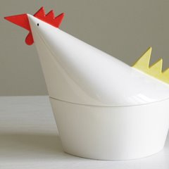
The 'Multilegs Cabinet'. Love the minimalism of the sheer finish, with a little surprise at the bottom - fun without looking like novelty furniture.

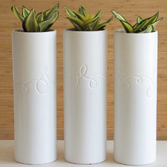
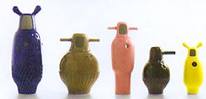
The 'Colors vases'. If you only ever need one vase, it's one that looks like a robot from the Jetsons.
Available from www.dalibd.com, Barcelona.
Images from June's Icon magazine.

Tuesday, June 20, 2006