I've long been interested in how cropping into an image or design can totally change its message or simply its style. And the false sense of simplicity of this video is fairly perfect for this song, too. I especially like the 'pen goes faster in the fast bits' idea - so simple but could have been so easy to mess up.
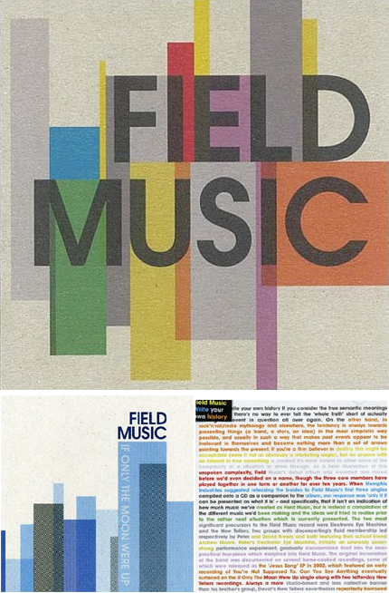
As this spiked my interest I had a look at some of their artwork which is rather nice too - reminiscent of the old blue-note jazz covers. I love the idea that the singles are striking, short sharp geometric compositions, whilst the album cover quite lierally tells the bands' story whilst keeping that colourful geometric aesthetic through typography alone (bottom right).

Field Music on myspace
Field Music's page on their label's site


No comments:
Post a Comment