Thursday, October 26, 2006

Diem Chau

Diem Chau is an artist who likes to tell stories;

Coming from a nomadic childhood, ...the things of greatest value to us were stories contributed by friends and family. Embedded in these stories are connections to the past, our culture and an occasional escape from reality.

...small deviations are what fascinate me with oral traditions. Ordinary events injected into fantasy worlds make them more believable but, at the same time, it makes them extraordinary. Stories enable us to live a more vivid life.


I came across her Storytelling series on notcot.com and had to have a look for myself. I love complex, intricate work like this, as it really forces you to get involved. Here, the crayons not only represent a kind of innocence that goes hand in hand with storytelling, but being such a universal memory for everyone they really include the audience in the story. You can't help but create your own narrative for this piece.

I especially like the characters who look a little bit shy and retiring, and the way that contrasts with the bright plastic colours. The throwaway pieces of paper wrapper still left on the bottom feel really precious too.
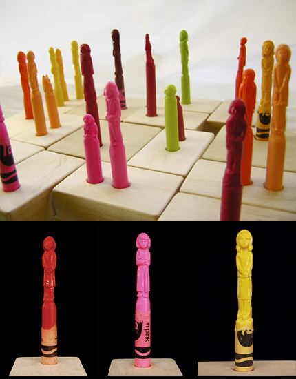


From left to right; Pigtails in Red, Bad Hair Day, Grandma in Beehive. All from Storytelling, 2005. Images copyright Diem Chau.

See more on her website, and contact her at diem@diemchau.com

Monday, October 09, 2006

I'm from Barcelona - Collection of Stamps


I'm from Barcelona's video for Collection of Stamps is just gorgeous - grey and yellow, mmmm. And as an added bonus, a ukulele! hurrah! And a rather nice song too.

The more introductory song We're From Barcelona does more to emphasise their sheer number though - how're they gonna divvy up royalties amongst all that lot?

Spotted on Superette.

Saturday, October 07, 2006

In Context


I've long been interested in how cropping into an image or design can totally change its message or simply its style. And the false sense of simplicity of this video is fairly perfect for this song, too. I especially like the 'pen goes faster in the fast bits' idea - so simple but could have been so easy to mess up.

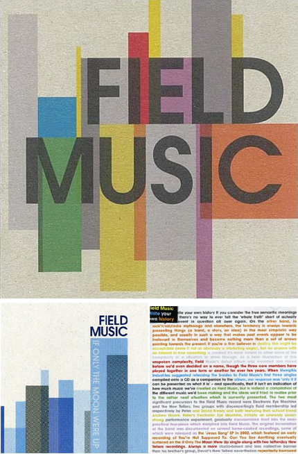
As this spiked my interest I had a look at some of their artwork which is rather nice too - reminiscent of the old blue-note jazz covers. I love the idea that the singles are striking, short sharp geometric compositions, whilst the album cover quite lierally tells the bands' story whilst keeping that colourful geometric aesthetic through typography alone (bottom right).

FieldMusicCovers

Field Music on myspace
Field Music's page on their label's site