Wednesday, August 22, 2007
Si Scott
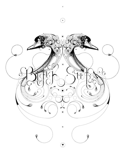
I can't believe I missed this exhibition - it's right up my street. Luckily Si Scott has a fantastic website with a selection of his Ink & Lyrics exhibition work and lots more besides. The full picture above really doesn't do Black Swan justice, so here's a detail too...
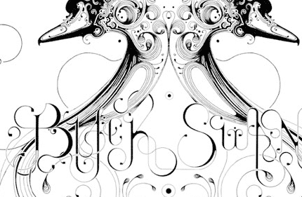
For lots more (and much bigger) images check out his website. Lovely.
I am rubbish
Wednesday, August 15, 2007
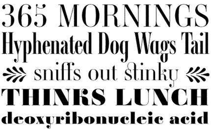
Ambroise
by Porchez Typofonderie.
I wonder how they think up those little poem-type things to show the fonts? Some of them are really quite pretty. Completely nonsensical but pretty nontheless.
Wednesday, August 08, 2007
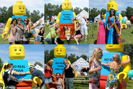
Lego Man Update
Thanks to some detective work (ie. a helpful comment - thanks Anonymous, whoever you are!) it turns out he's quite a popular guy. reddit has some more in depth information but surfice it to say he has been a very popular art installation - until someone dumped him in the sea that is. He even has his own website.
Tuesday, August 07, 2007
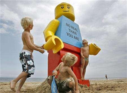
Giant Lego Man Found in the Sea
"No real than you are". What could it mean?
AMSTERDAM (Reuters) - A giant, smiling Lego man was fished out of the sea in the Dutch resort of Zandvoort on Tuesday.
Workers at a drinks stall rescued the 2.5-metre (8-foot) tall model with a yellow head and blue torso.
"We saw something bobbing about in the sea and we decided to take it out of the water," said a stall worker. "It was a life-sized Lego toy."
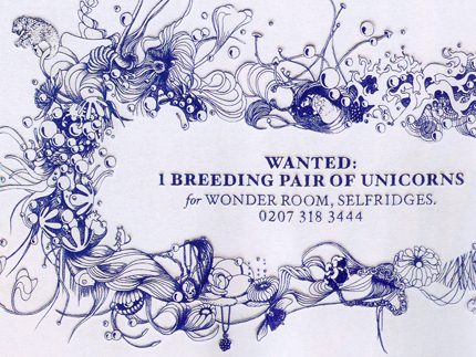
Gorgeous Letterpress Ad.
The Selfridges website has a nice feature related to this at the moment too - a wonder search. There's a big long alphabetical list of lots of peoples 'wonders' (although unfortunately you can't read past O at the moment as the link to the next page is broken - rubbish!) that make some interesting (if slightly pointless) reading. It has a nice header too, but unfortunately it bears no relation to the ad in September's Vogue. How odd. I'd think a brand as huge as Selfridges (a guardian for a lot of other prestige brands no less) would do this a bit better really. It seems like all the thought went into the lovely ad and the rest got a bit cobbled together.
Wednesday, August 01, 2007
Marian Bantjes
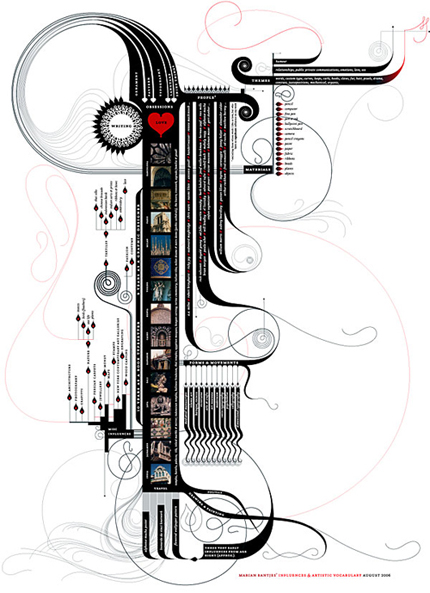
Marian Bantjes' website is full of swirling typography, gorgeous design and special bits like this, a map of influences. There are much larger details of it here. A fantastically simple idea and a lovely piece. Marian Bantjes' website is a goldmine of inspiration itself!
Subscribe to:
Posts (Atom)