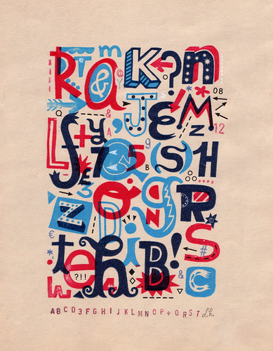
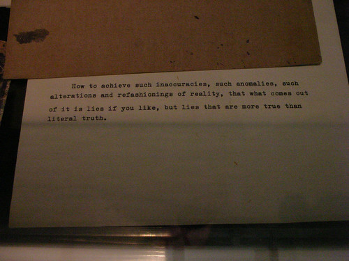
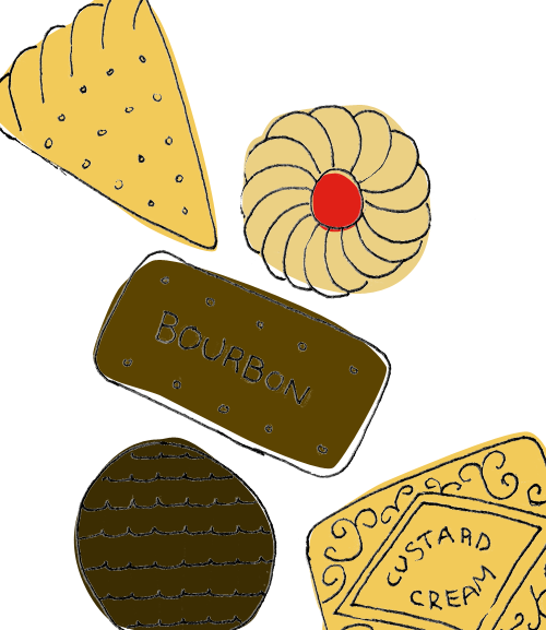
A screenshot of something I don't entirely understand. I think it's quite beautiful though...
Friday, December 19, 2008
Tuesday, December 09, 2008
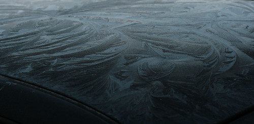
Frosty Patterns
I've been neglecting my blogging a bit lately due to my job going COMPLETELY MENTAL but I'm back now.
Noticed these lovely ice patterns on my way to work this morning.
Tuesday, November 25, 2008
Friday, November 14, 2008
Thursday, November 13, 2008
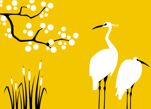
Mibo Downloadable Calendar
Tuesday, November 11, 2008
Apak
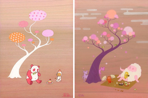
Some psychedelic cuteness from Apak. Available to buy on Etsy. They're also featured on the, erm, charming, Charming Wall gallery.
Monday, November 10, 2008
Good Shape Design
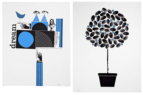
Some nice posters available at Good Shape Design, the work of Wayne Pate. At $30 a pop for silkscreen prints I think they're pretty good value, even though they don't appear to be limited edition.
Via Design*Sponge.
Wednesday, November 05, 2008
Callie Shell: Obama
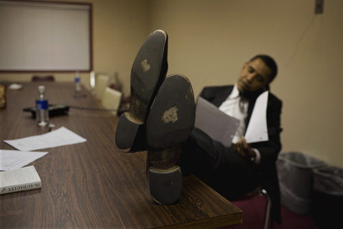
© Callie Shell / Aurora for Time
Callie Shell first encountered Barack Obama when she was producing what turned out to be an award winning photo essay about John Kerry's presidential campaign. According to digitaljournalist.org, she ended up turning in more photographs of Obama than Kerry, saying "I just have a feeling about him. I think he will be important down the road."
The full photo essay.
Time Magazine's selection for Barack Obama: Portrait of a Candidate.
Tuesday, November 04, 2008
Today's The Day
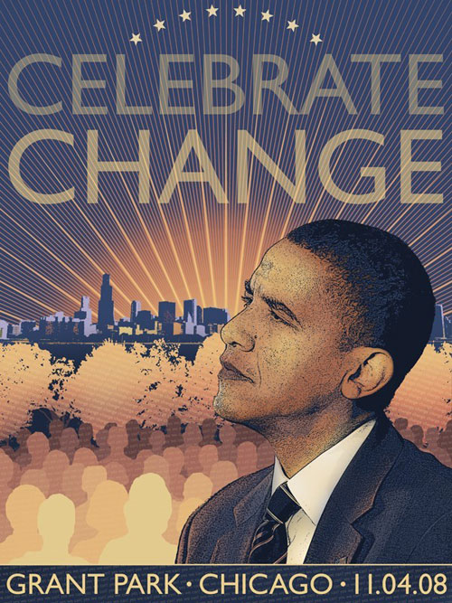
Celebrate Change limited edition print by AngeliArndt
I'm not going to say a lot about the whole design + Obama thing, as plenty of other people have already posted much more eloquent points than I think I could squeeze into the last bit of my lunch hour (see below). But it has really struck me how everyone seems to be getting involved. Maybe it's more of an indicator of the design trends in general and the surge of designer/makers and craftspeople facilitated by things like etsy, folksy, dawanda. Whatever it is, it has to be good in terms of people actually getting out and voting, whoever they decide to vote for.
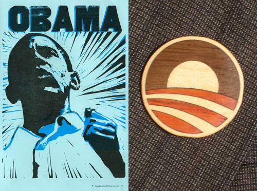
Hand printed lino cut by Jason Krekel at HandcrankedUSA
Wooden inlay pin at Obamastuff
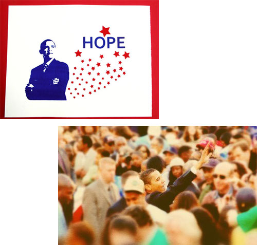
Hope silkscreen by mmsuperstuff
Photograph © Marisa Allegra Williams
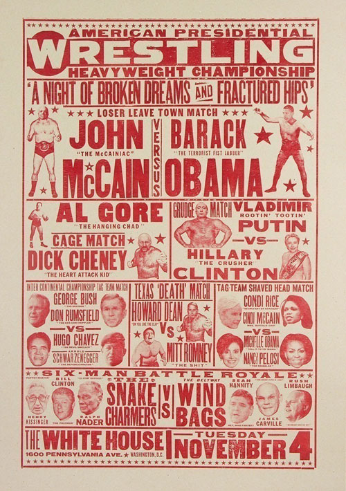
American Presidential Wrestling letterpress poster from YeeHaw
Just a couple of many more eloquent posts I mentioned;
Michael Johnson's Design Week/Thought For The Week article
Steven Heller
Monday, November 03, 2008
Typocalypse

Subliminal messages fonts give as you scroll down that list... They pretty much all made me smile. By Lars Willem Veldkampf.
Monday, October 27, 2008
Paul Catherall
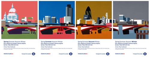
I saw some of Paul Catherall's work, and an interesting short film about his linocut process, at the London Transport Museum this weekend. He has a really distinctive style and uses colours in an unusually poetic way that grabbed my attention - I remember seeing these out and around on the tube.
This particular series, Four Seasons, is available to buy at the Transport Museum Shop.
Tuesday, October 21, 2008
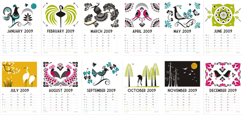
Beau Ideal Editions Calendar
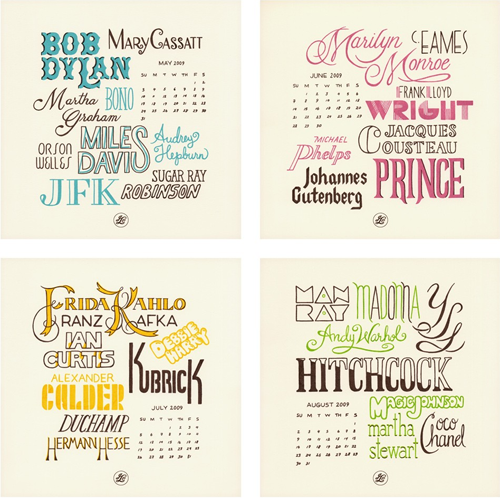
A gorgeous new calendar from Beau Ideal just popped up on my reader. Hand screen printed in limited edition, it's slightly pricey at $48 plus delivery but there's obviously a lot of work and love gone into it. A simple idea that's been designed really consistently and effectively, with loads of yummy hand-drawn type. Yep yep.
Monday, October 13, 2008
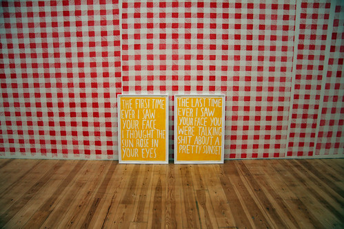
Saw Your Face
Something, somewhere in Amsterdam.
It made me smile.
Update: This work is by Marijn van Kreij and Alistair has more info on the exhibition here.
Wednesday, September 17, 2008
Wellcome Award Images
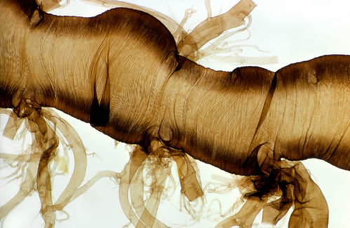
Lovely abstract stuff from the Wellcome Image Awards. All microscopic scientific imagery, some of it is surprisingly beautiful. The Silkworm Trachea above I thought was lovely, and the red blood cells are particularly arresting too.
Full gallery.
Lotta Bruhn
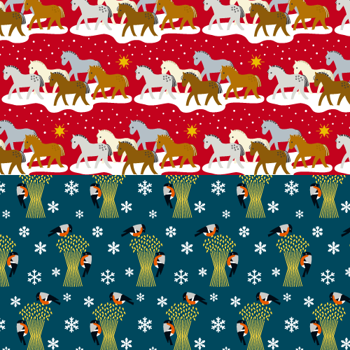
Lovely Christmas patterns from Lotta Bruhn. Those birds definitely have an edge of Charley Harper about them - no bad thing...
Schtock
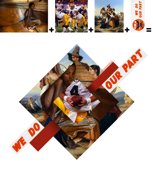
Found an interesting site today via Veer put together by someone who works at a stock photography agency. Apparently they just want to share all this visual candyfloss with the world out of the goodness of their heart. Hmmm. Think I have to agree with The Denver Egotist's views on it's innocence, but it's interesting non-the-less. The main gallery part of the site is comprised of photo-montages using a variety of available stock, but the blog of what's 'just crossed the desk' is an interesting look too.
Monday, September 15, 2008
New from Recycle Club
New characters on Flickr from the always brilliant Recycle Club. These images make me feel so happy!
Thursday, September 11, 2008
French Found Type
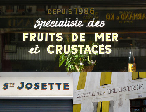
In-keeping with my French mood at the moment, I found the fantastic Jules Vernacular blog full of French found type today. There's some lovely stuff on there.
Wanderlust Map

There's a really nice interactive map featuring famous routes on the Good Magazine website. It's a little light on information once you get into it but it could be really interesting if/as it grows. (And why haven't Google maps done this already?)
Tuesday, September 09, 2008
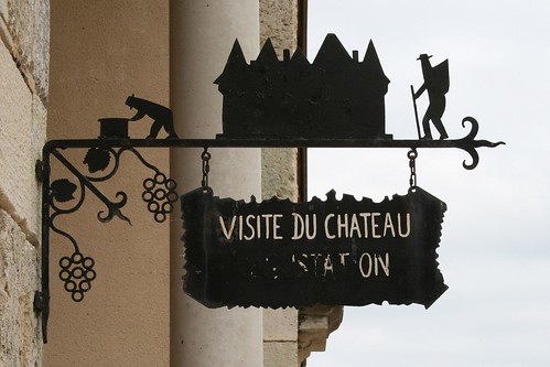
Chateau Sign
Spotted this sign while I was in France - lovely. A bit Rob Ryan I thought - the people remind me a bit of the Crooked Man on this book cover.
Monday, September 08, 2008
Sunday, August 31, 2008
IBM 1975 - The Future
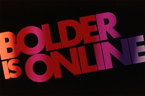
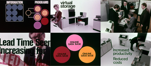
These images of a 1975 IBM presentation have survived to become part of the enormous Square America collection. Besides the obvious intrigue of the future in the past (if you know what I mean), I think the design stands up pretty well 33 years later.
Thursday, August 28, 2008
Monday, August 18, 2008
Faber Finds
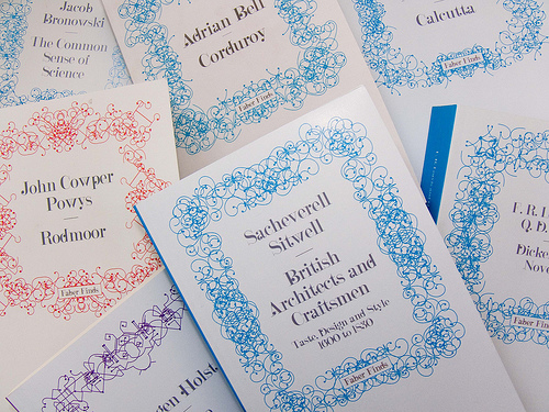
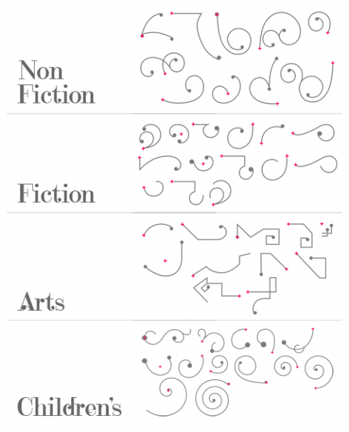
The new service from publisher Faber & Faber looks really interesting - as digital printing becomes ever cheaper it's now viable for them to re-produce out of print books to order. Faber Finds is also unique (I think) in it's use of a "design machine" (as they call it) to generate a unique cover for each and every book ordered. What a great way to make a book really special, as well as a great solution to making print on demand accessible and well designed. The talents of Marian Bantjes for the border design (elements shown below), who has some more lovely examples if you follow that link, Karsten Schmidt for the technical bits and Michael C. Place for the custom typeface have been brought together fantastically well.
Friday, August 08, 2008
Thursday, July 31, 2008
Marian Bantjes - Love Stories
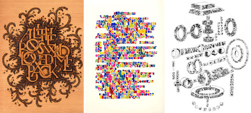
Marian Bantjes has just published a set of fantastic personal work in the latest Monograph (available to Creative Review subscribers only). Luckily the Creative Review blog also has a bit of information about it, and you can see lovely big images of all the work on Marian's website. Each of the beautiful pieces is the story of someone she loves, and you really get a sense of the people behind these.
Wednesday, July 16, 2008
American Craft Magazine
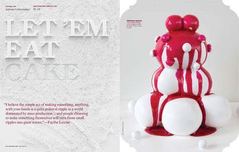
Another interesting guest post on design*sponge about American Craft's move towards more hands-on typography. Some lovely images. I'm going to try and hunt a copy of this down.
Ray Fenwick - Magic Tricks
More lovely stuff. I recommend a good look through his Flickr, it's all fantastic.
Tuesday, July 15, 2008
Chicago Type

In a refreshing change in tone, there's an interesting guest post over on design*sponge all about type. It led me on to chicagotype.com, an archive of found type in and around Chicago; some good, some bad, some just interesting. No tranquilizers.
Monday, July 14, 2008
Wednesday, July 09, 2008
Casey O'Connell
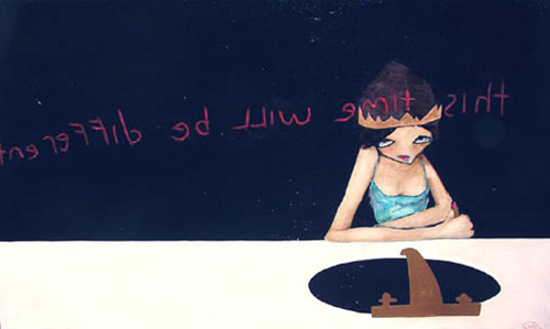
There's a great interview with Casey O'Connell over on Josh Spear at the moment. An interesting read and some beautiful work.
Friday, July 04, 2008
Tuesday, July 01, 2008
Douglas Wilson
Sometimes this internet thing just really works, doesn't it? onpaperwings added me as a contact on Flickr, so I had a look at his lovely letterpress work, and found his gallery, website and blog. All worth a look.
Friday, June 27, 2008
Little Factory
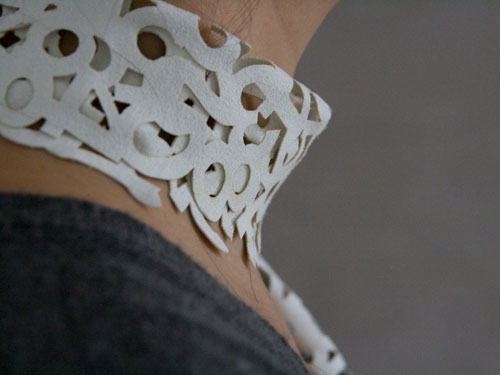
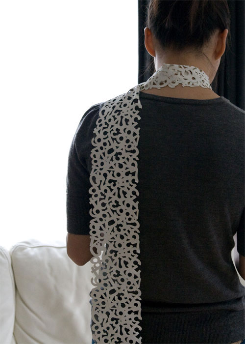
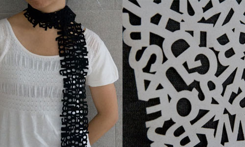
The perfect scarf to hang up next to your new 'hello' doormat! Buy them here in black or white. There's also uppercase and lowercase letters available, but they seem to be having some trouble keeping up with the demand.
Wednesday, June 25, 2008
Thursday, June 19, 2008
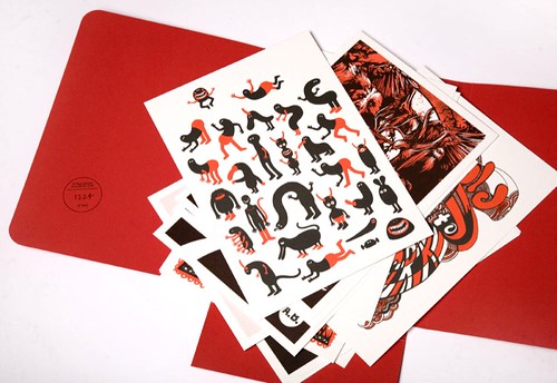
Ubiki - Rawr!

I just found this great print after Holly mentioned his work. According to Ubuki "Rawr!" is what monsters say when they're hungry/want a hug. I couldn't agree more!
There are more gorgeous images on Ubiki's Etsy shop.
Wednesday, June 18, 2008
Thursday, June 12, 2008
Beautiful Book
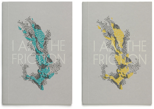
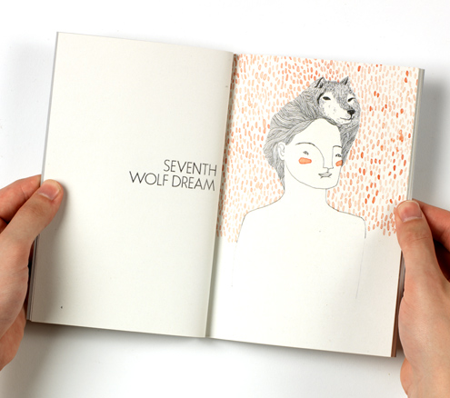
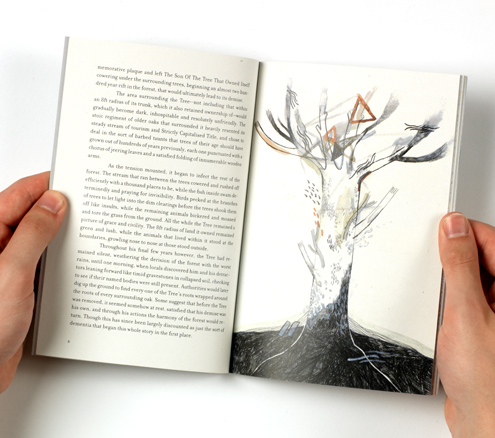
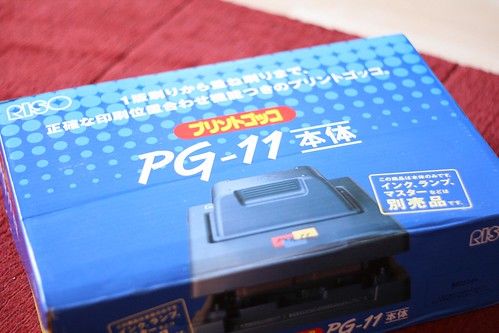
I Am The Friction is a collaboration between Jez Burrows and Lizzy Stewart of the Evening Tweed collective. It looks like a beautiful book - printed dos-à-dos with the help of a trusty gocco printer. (I can only aspire to this kind of quality, my prints are still turning out pretty rough. But it's inspiring to know someone has produced covers this fantastic with one!) One half of the book is composed of short stories inspired by illustrations, while the other contains illustrations inspired by short stories. I wonder if they know each others work so well that they will turn out to be pretty similar though? Apparently they will be available soon, watchthis space.
Spotted thanks to the lovely Freshly Blended
